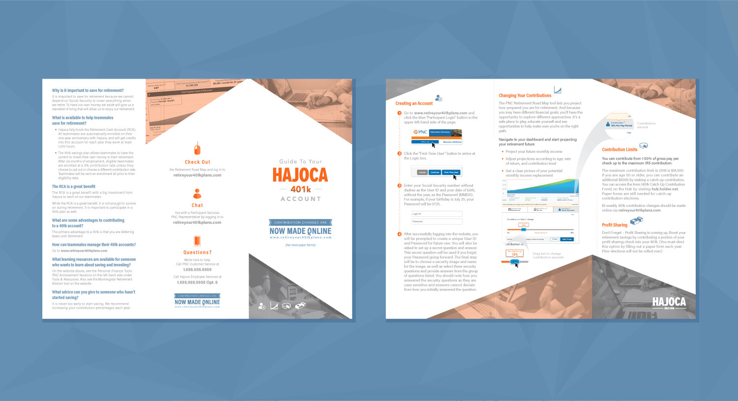
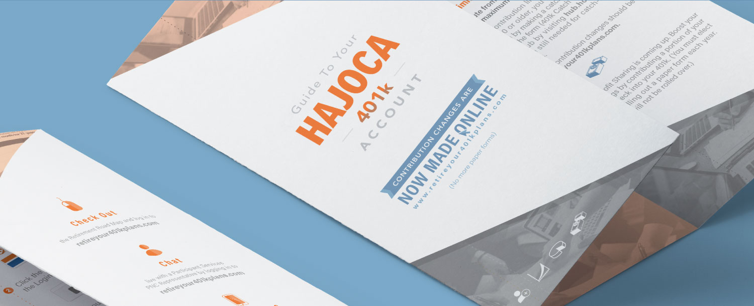
Portfolio
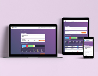
UX/UI, Web Dev, Branding
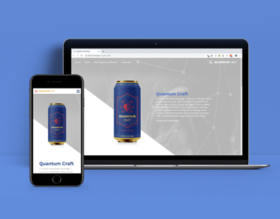
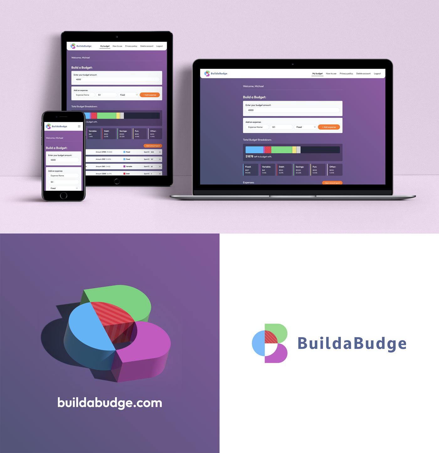
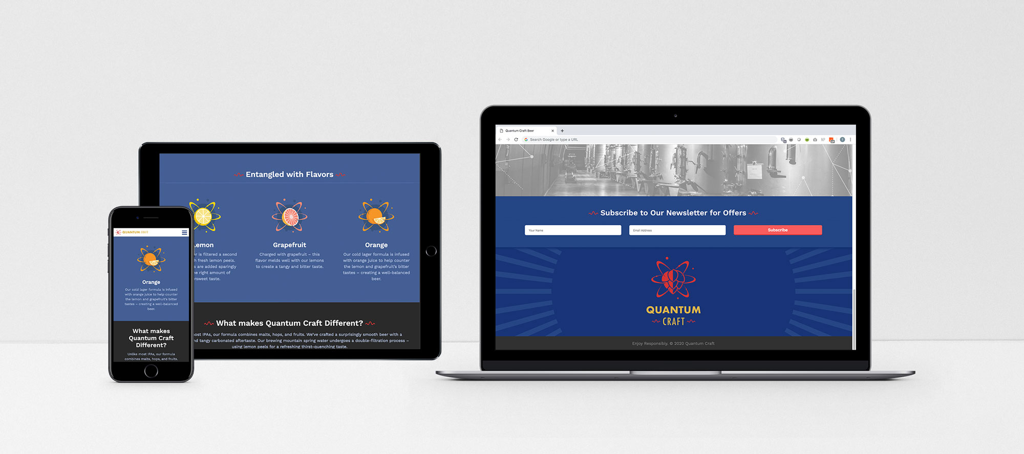
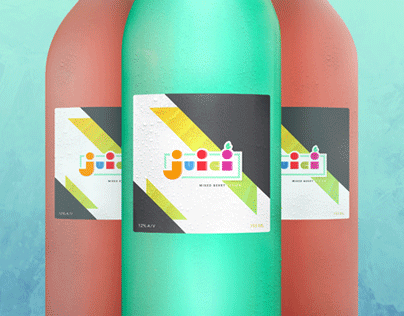
UX/UI, Web Dev, Brand, Package
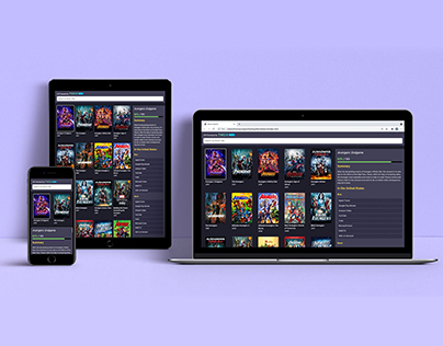
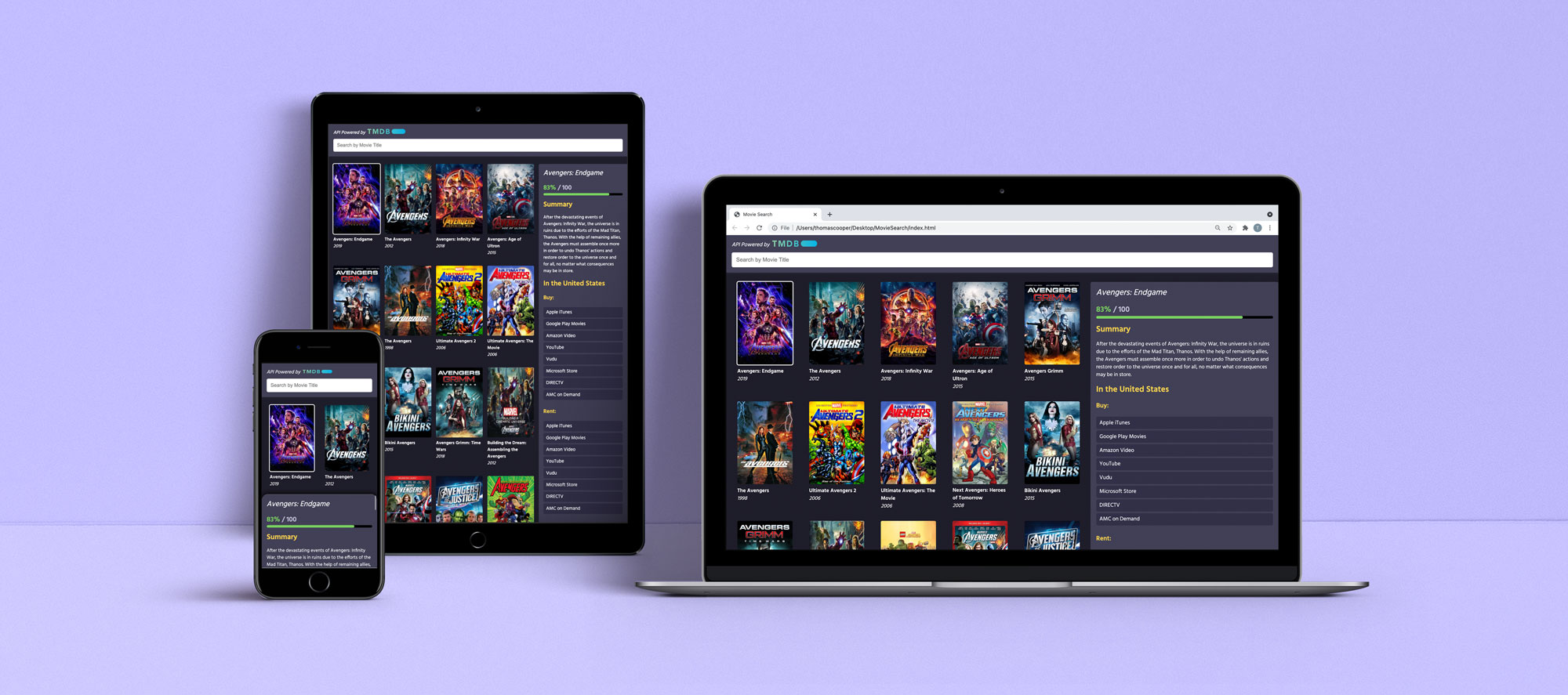
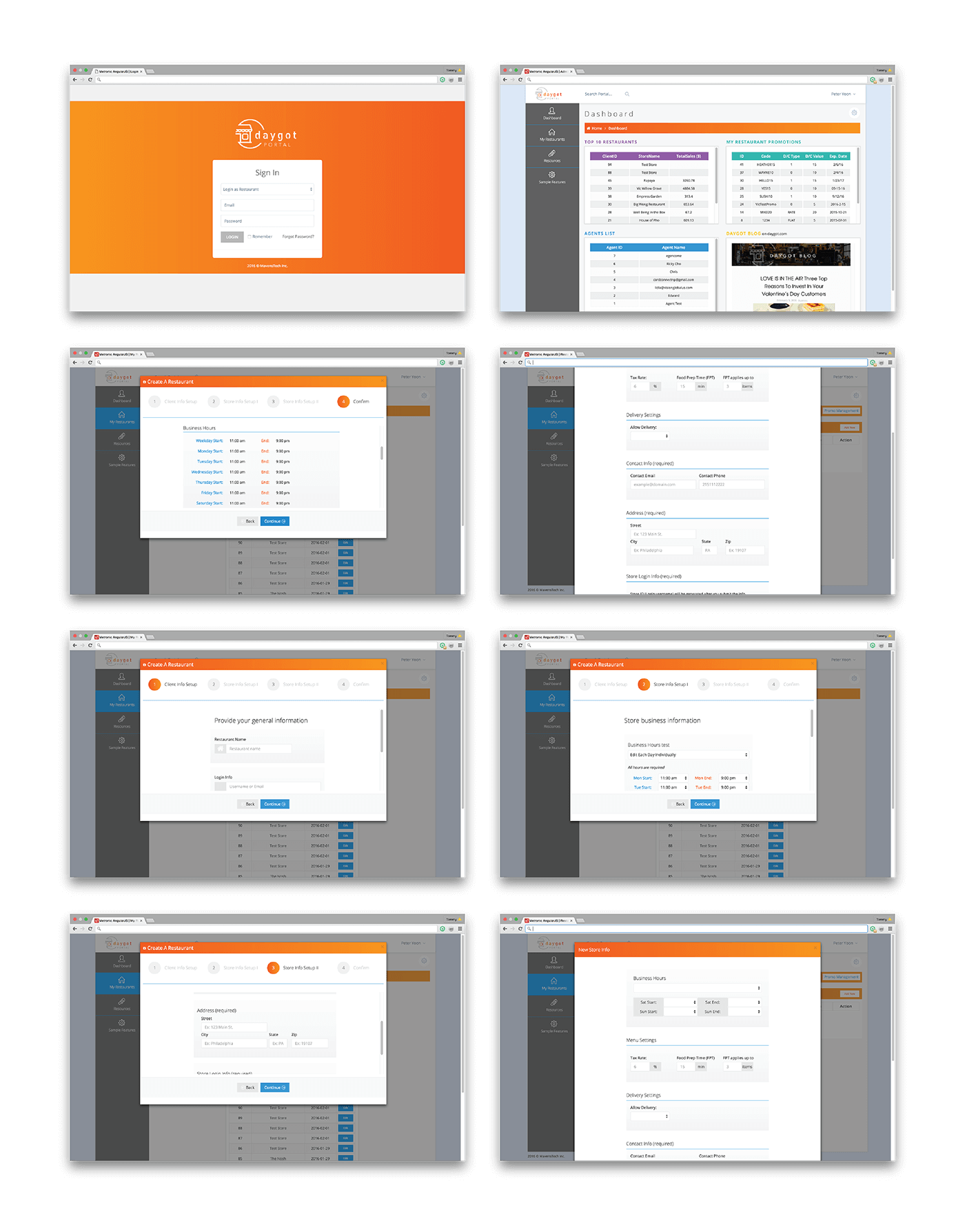
UX/UI, Web Dev
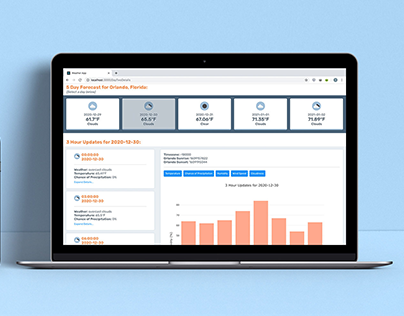
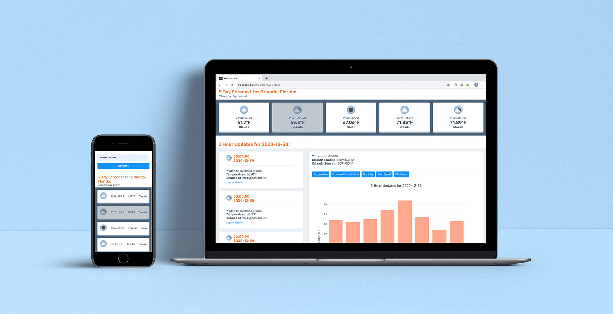
UX/UI, Web Dev
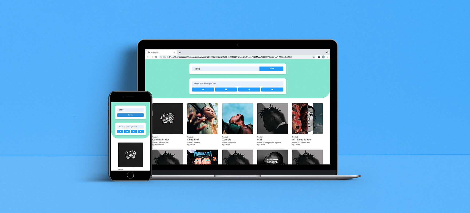
UX/UI, Web Dev
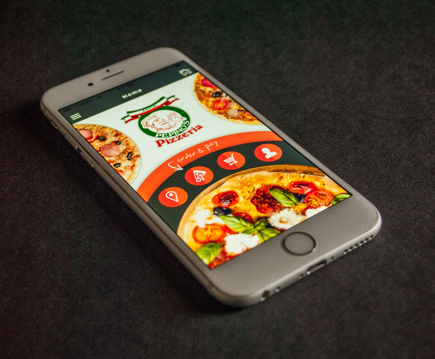
UX/UI, Web Dev, Branding
UX/UI, Web Dev, Branding
UX/UI, Web Dev, Branding
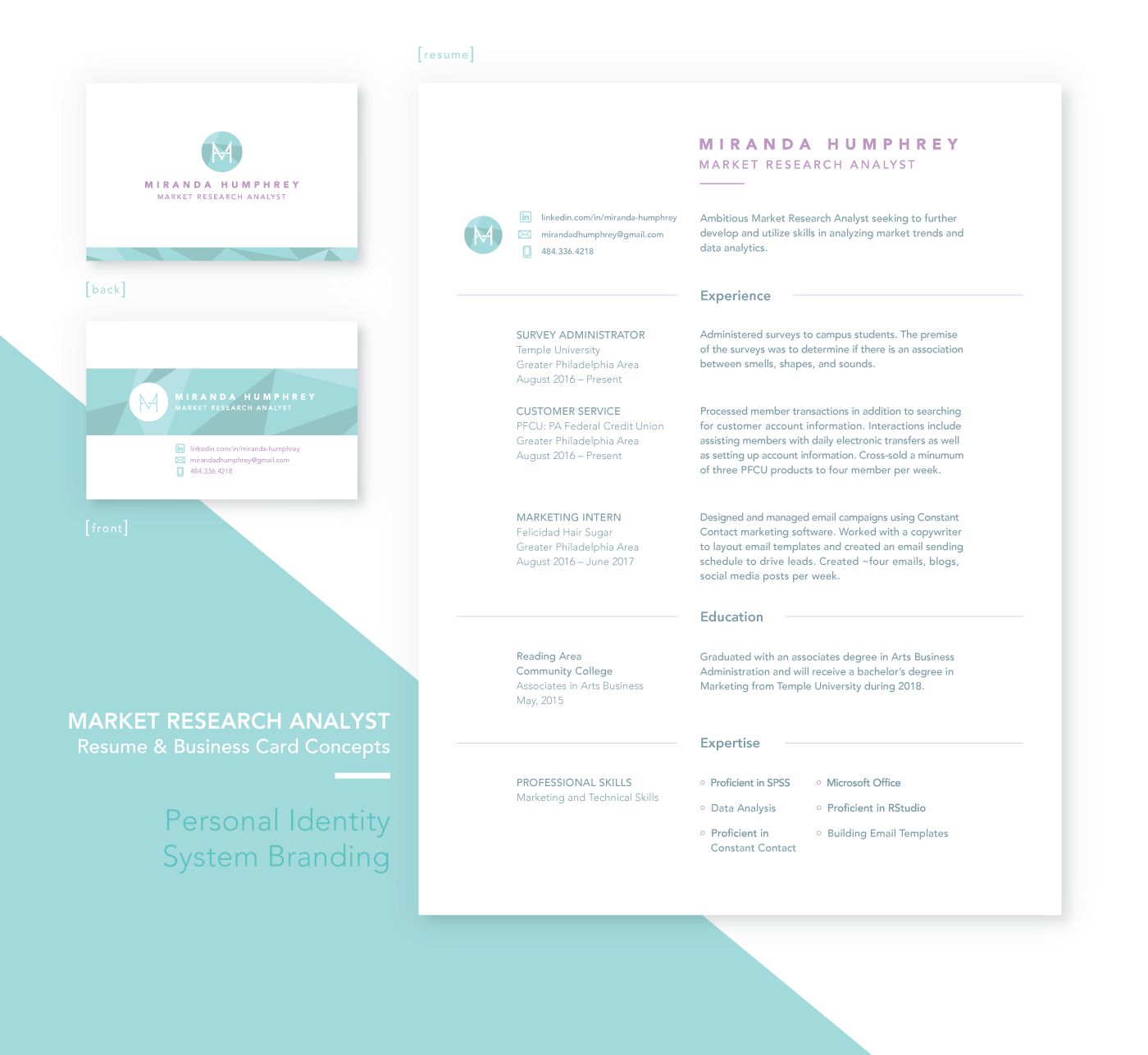
Layout, Typography
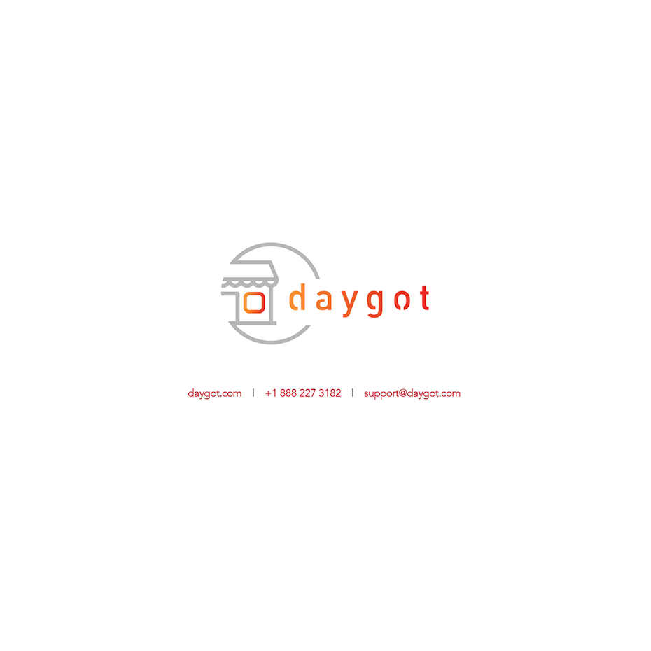
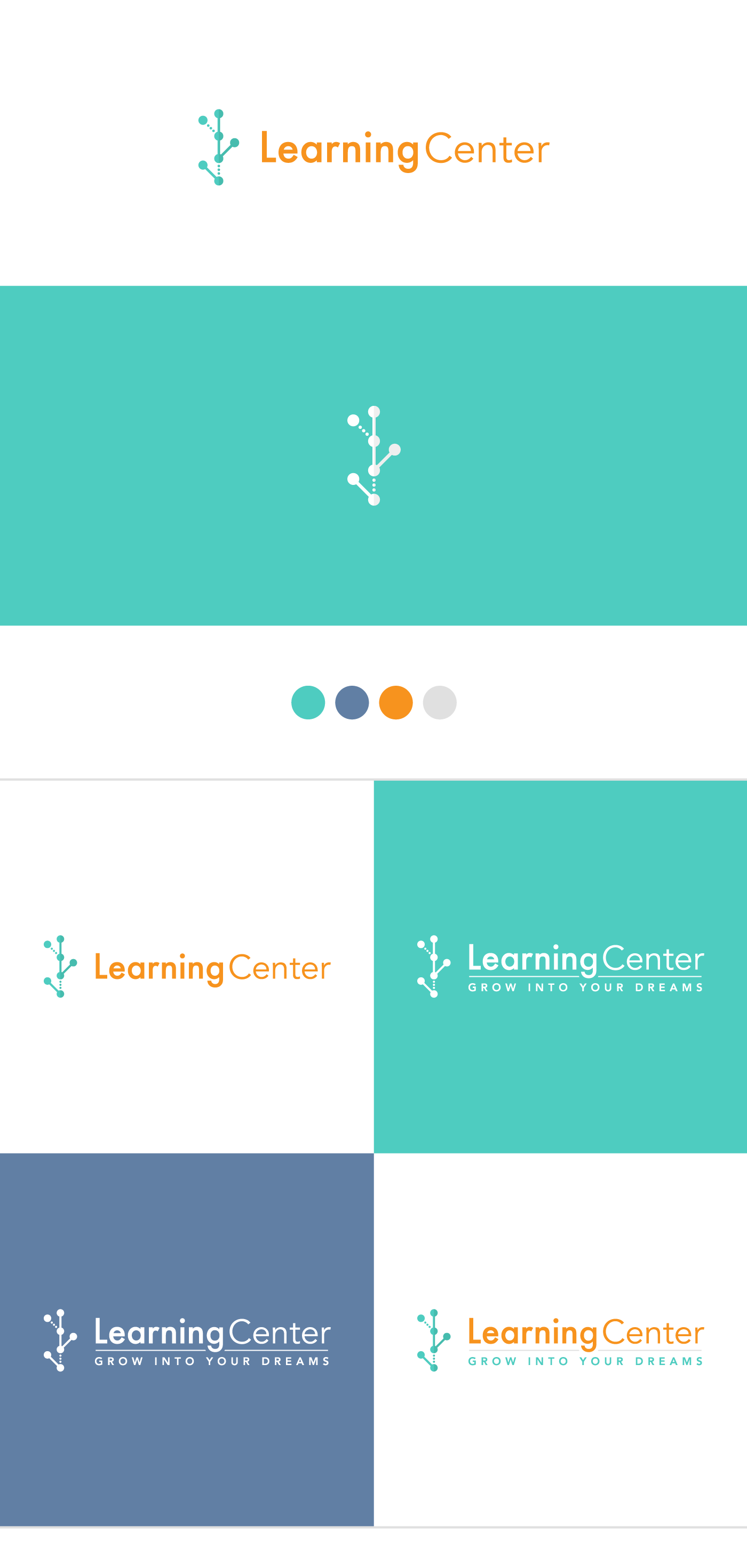
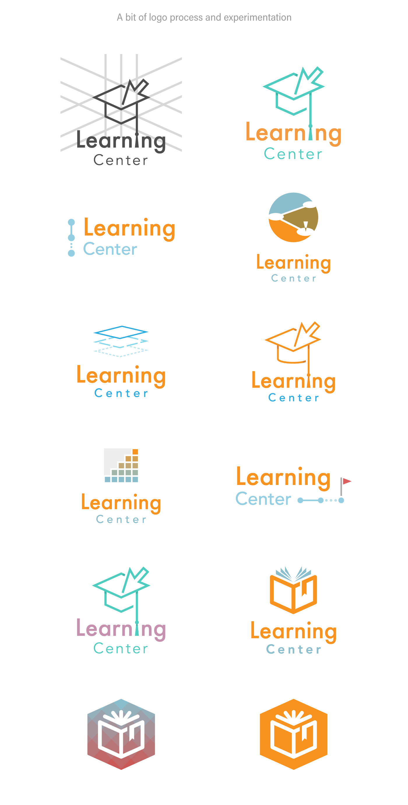
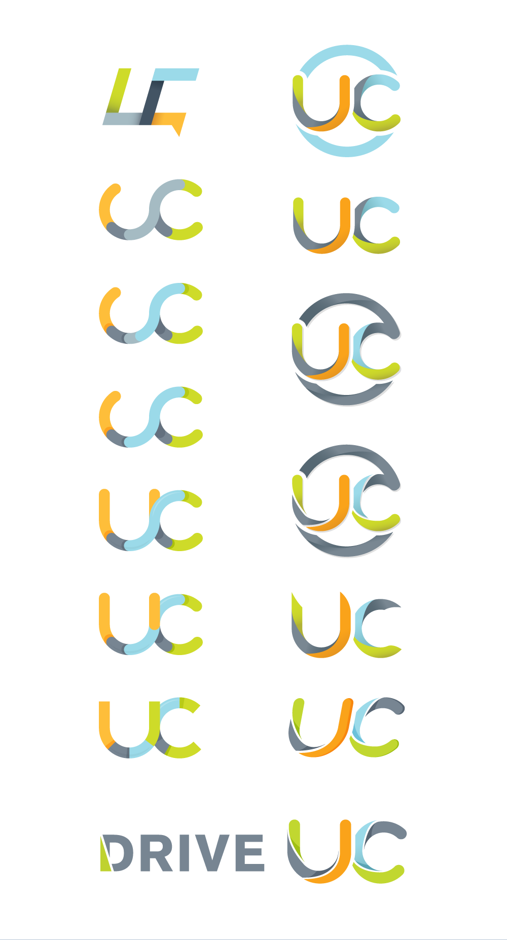
Brand
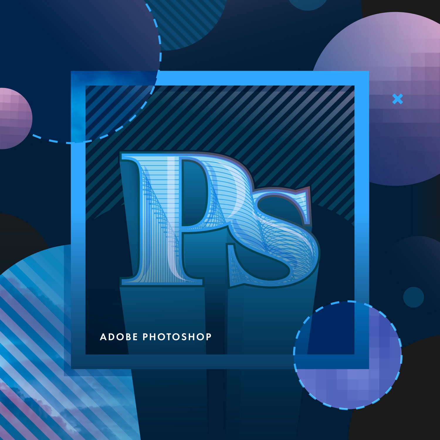
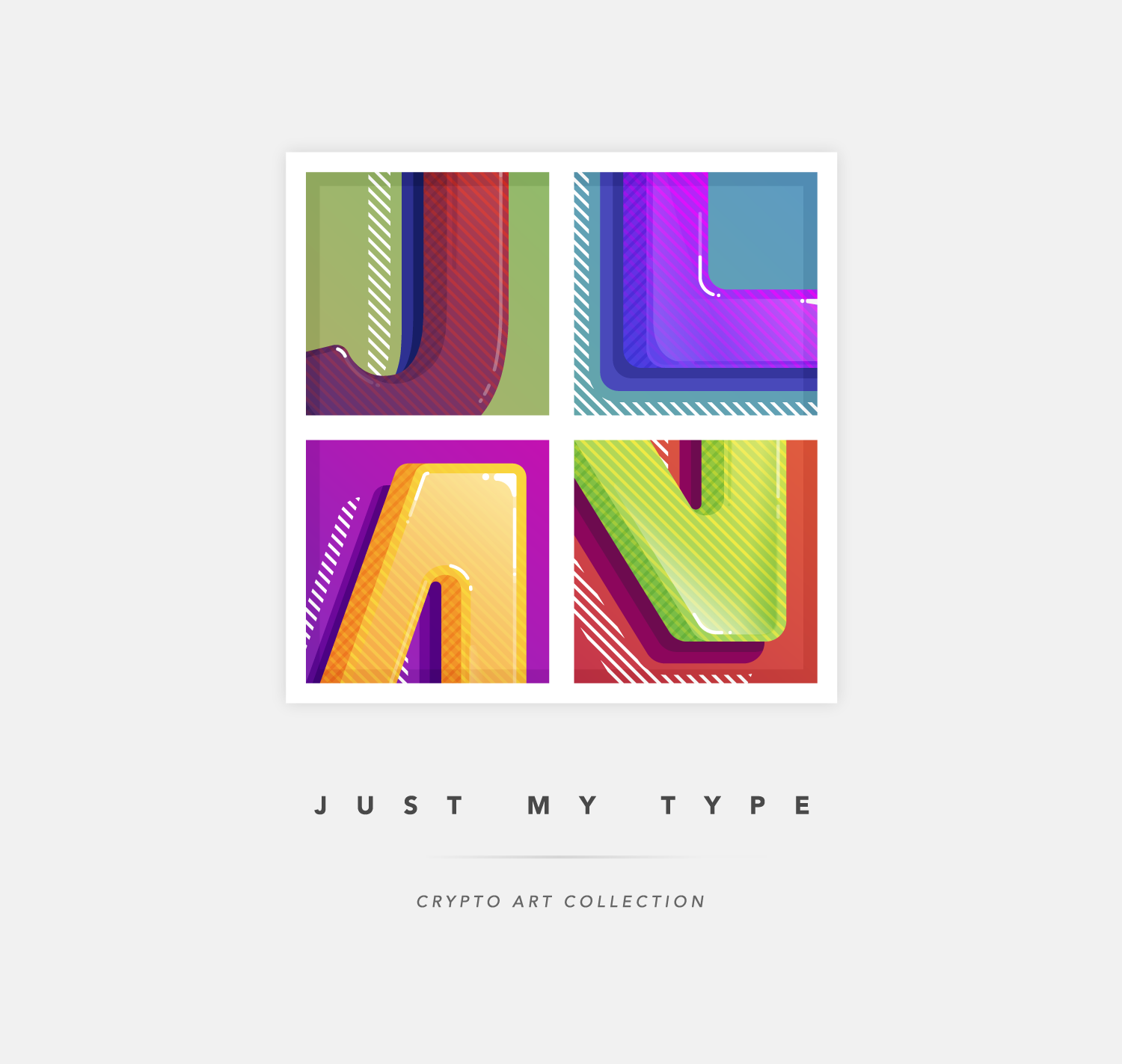
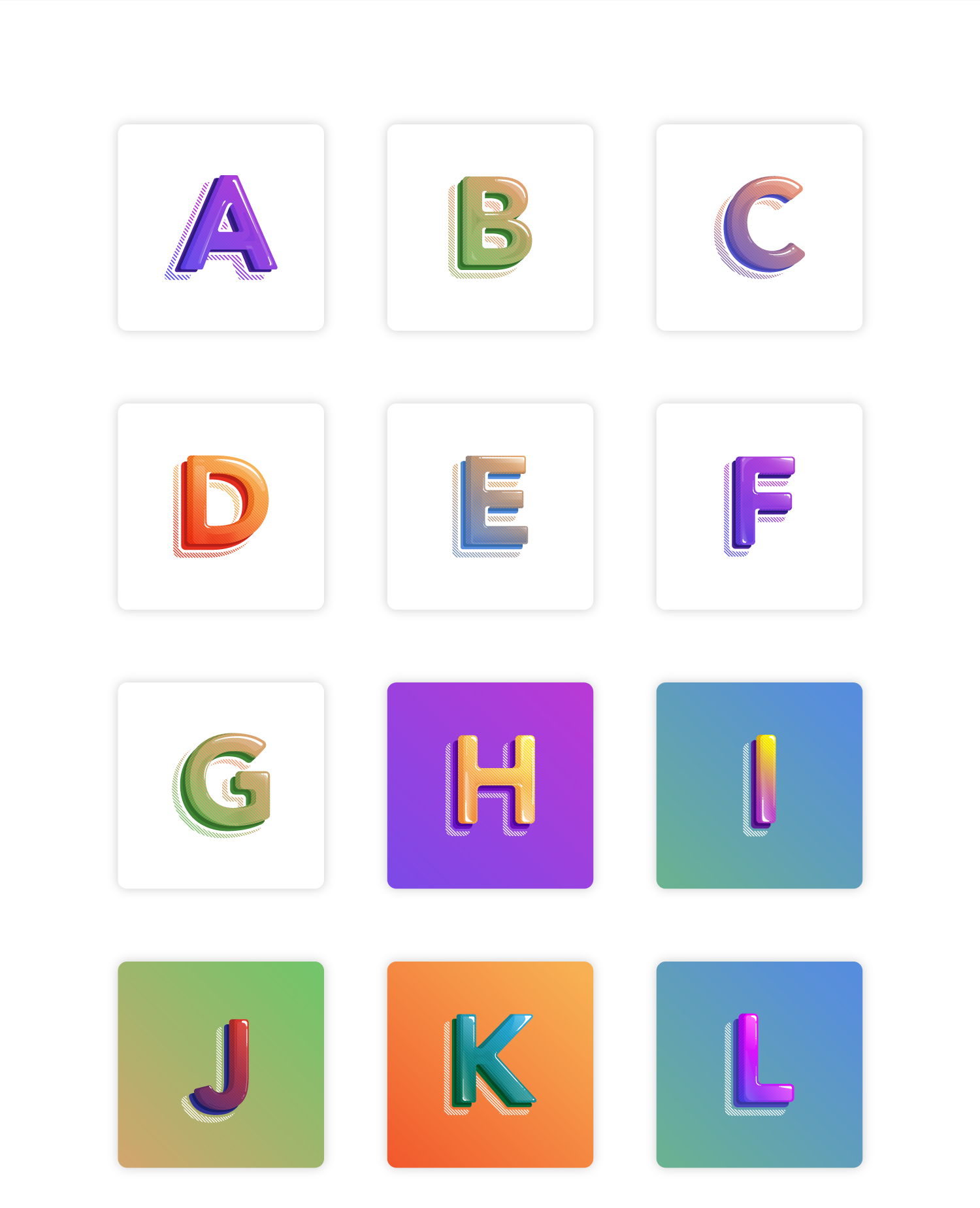
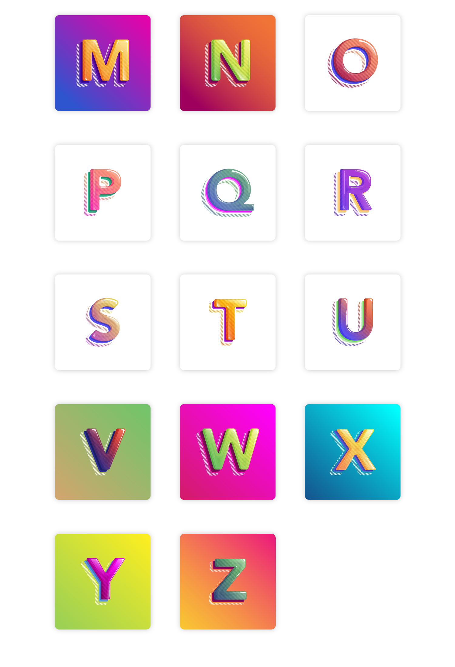
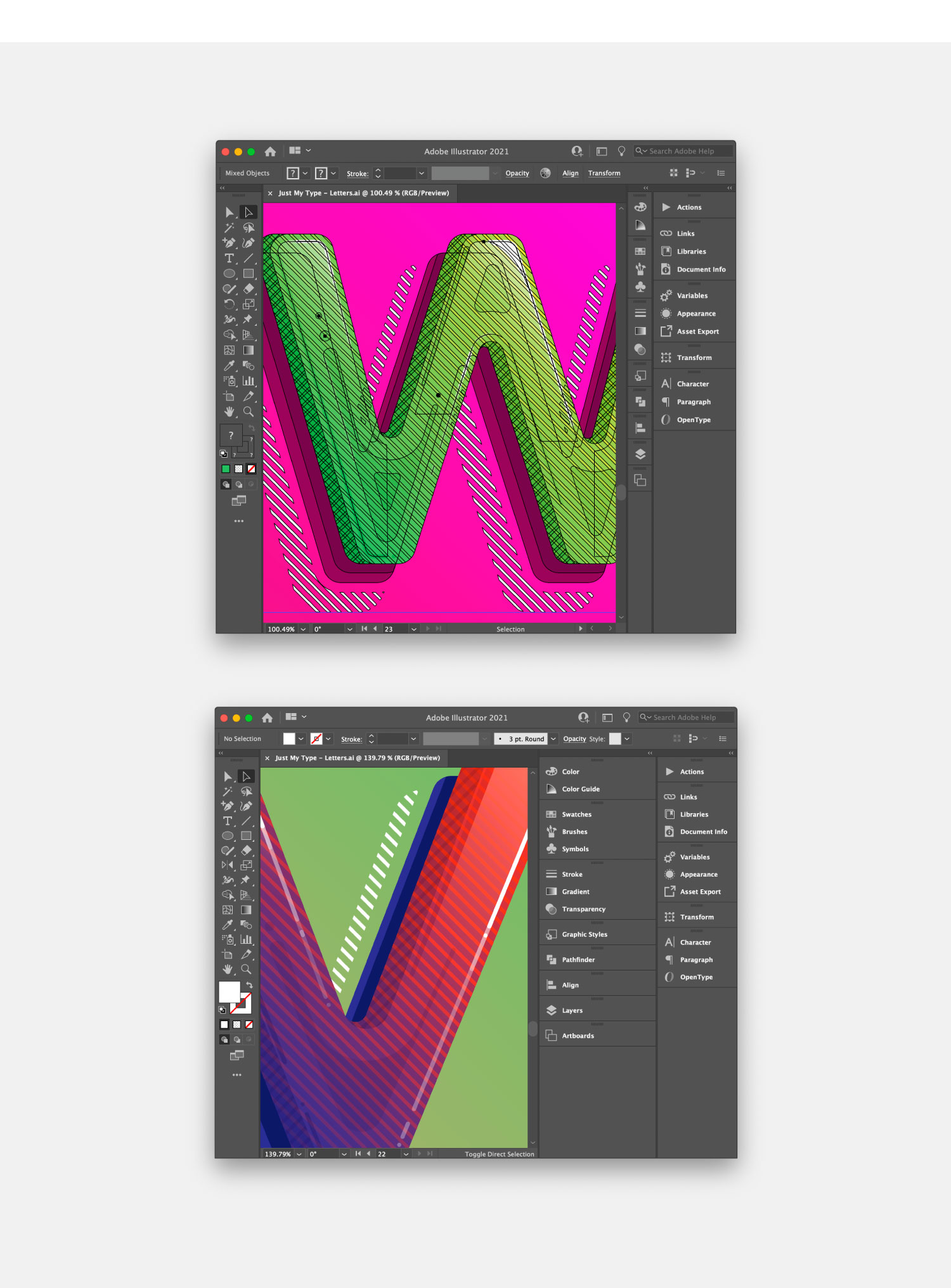
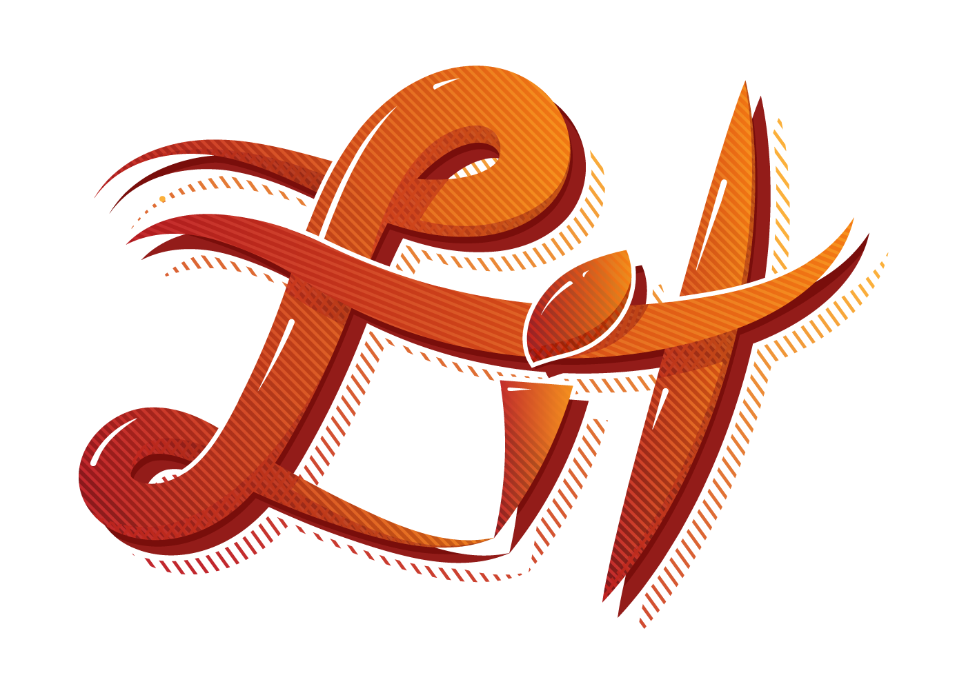
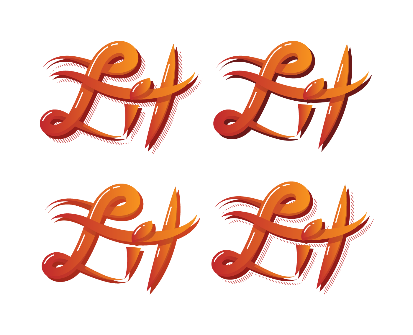
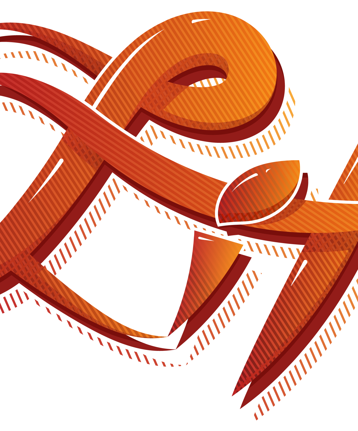
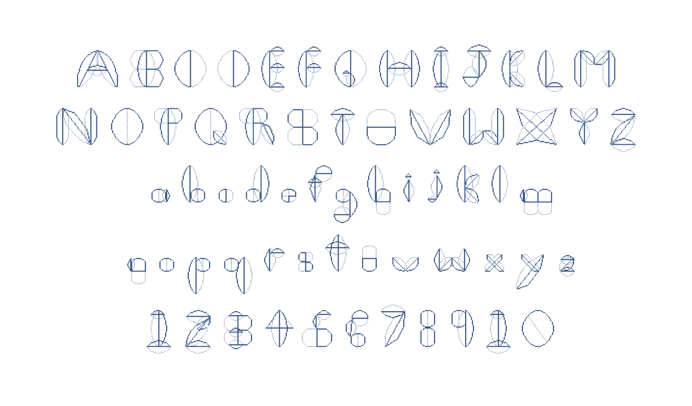
Typography
Typography

Brand, Animation
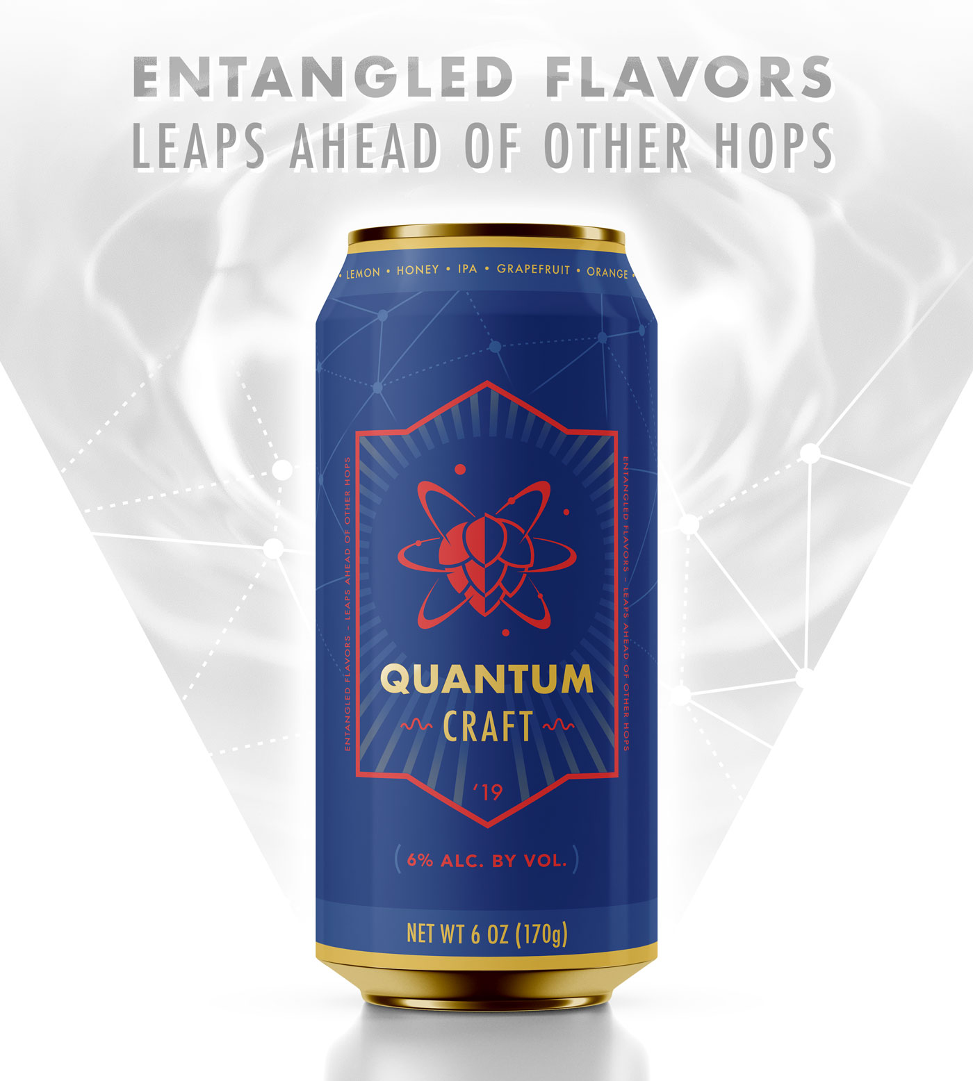
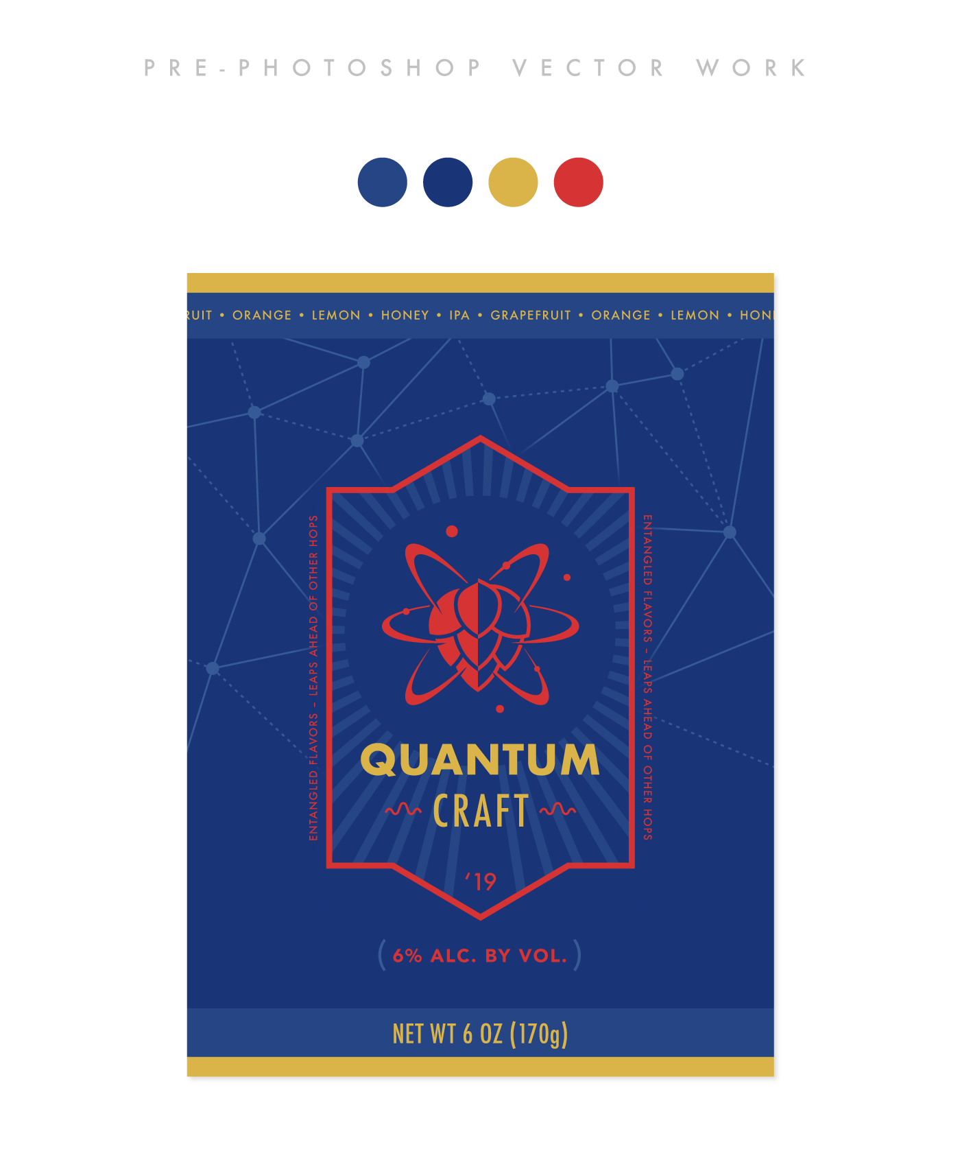
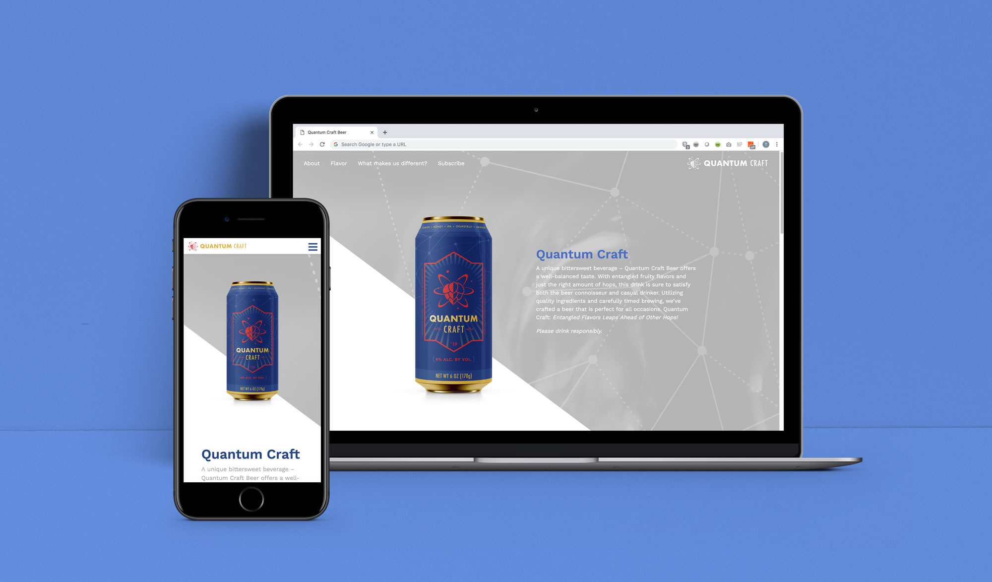
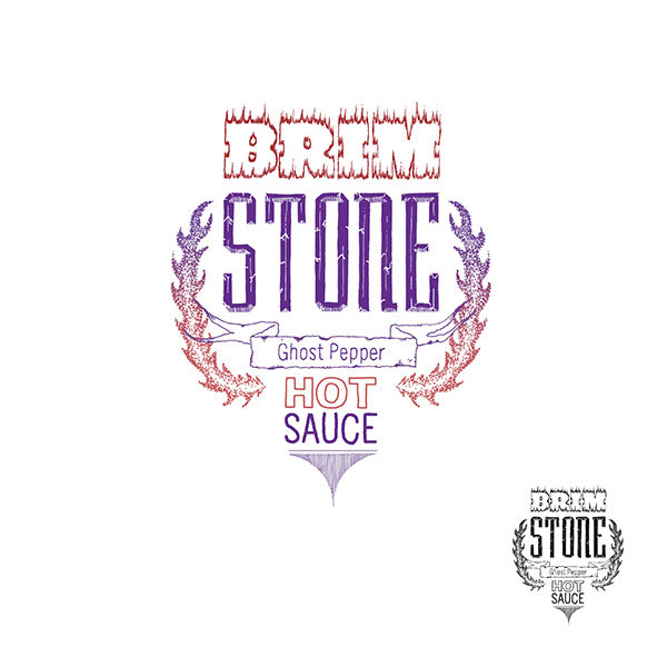
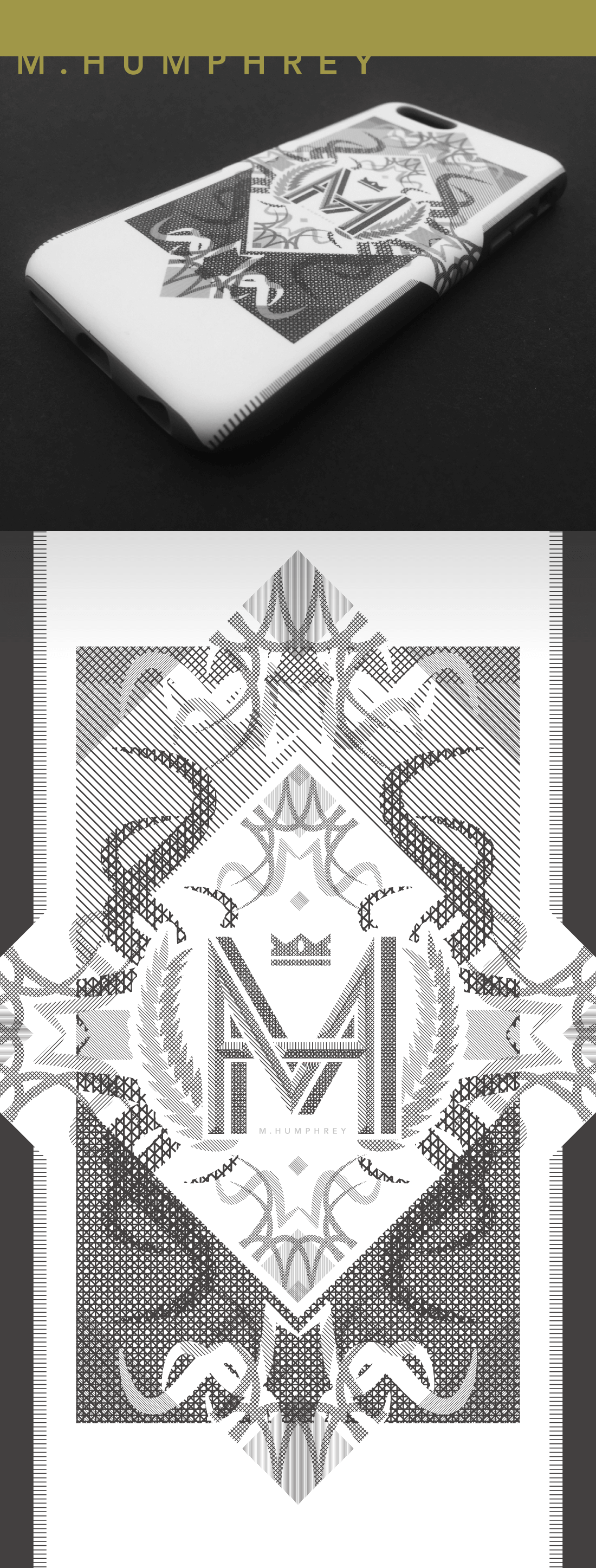
Brand, Package, Typography
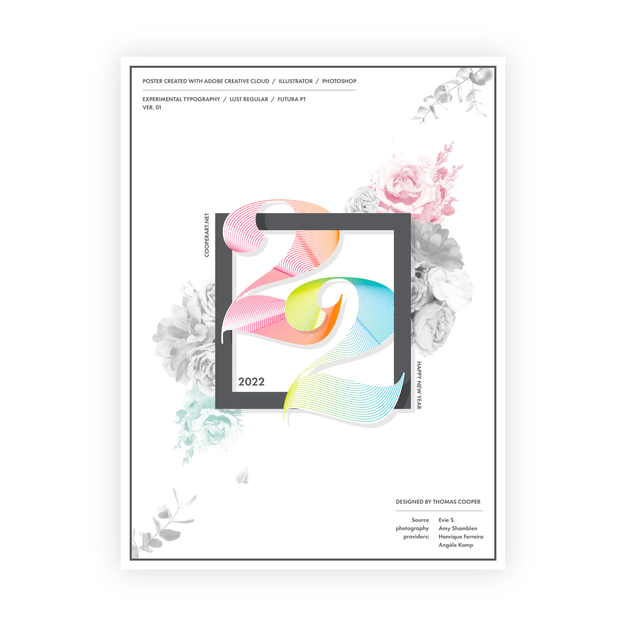
Layout, Typography
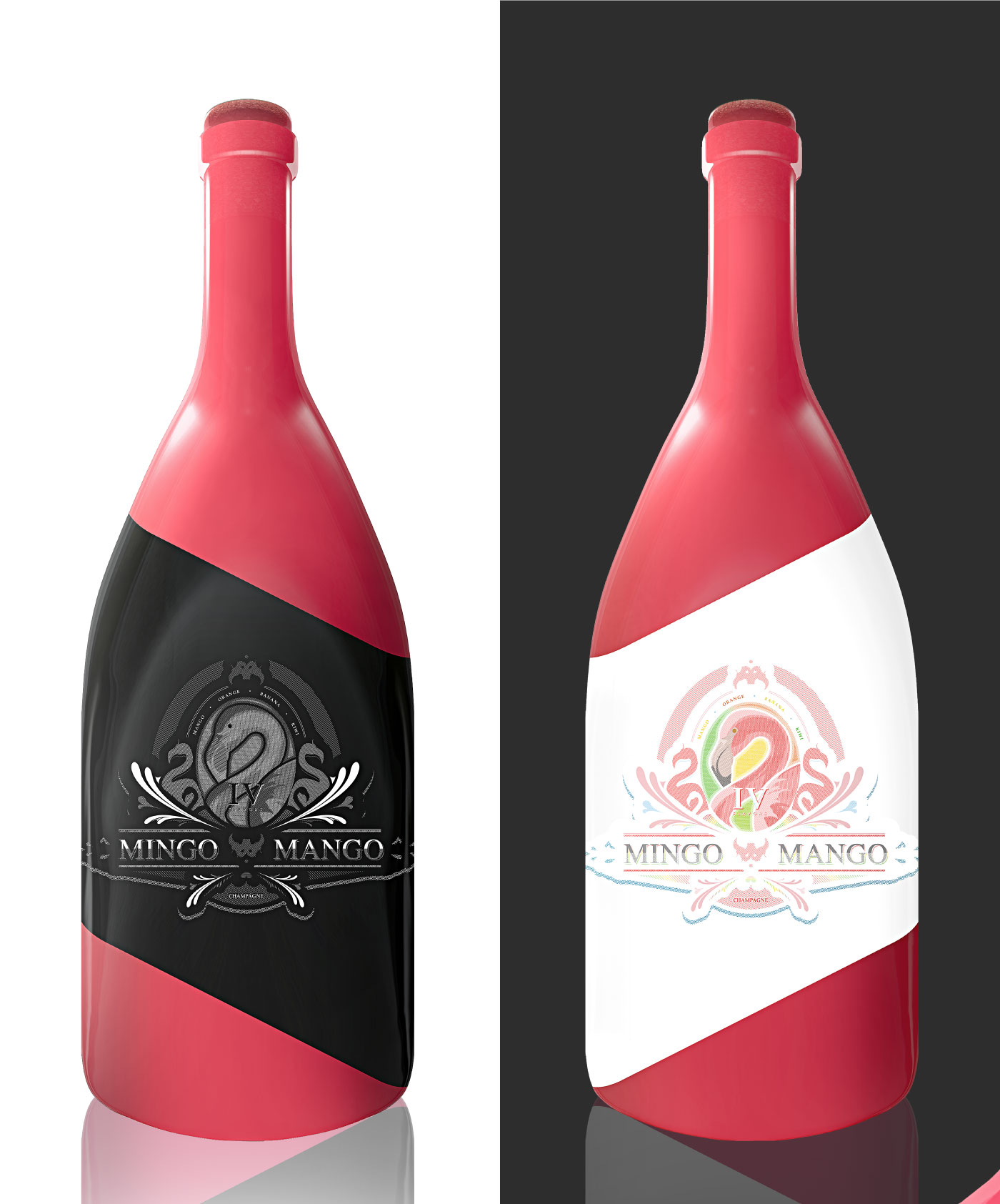
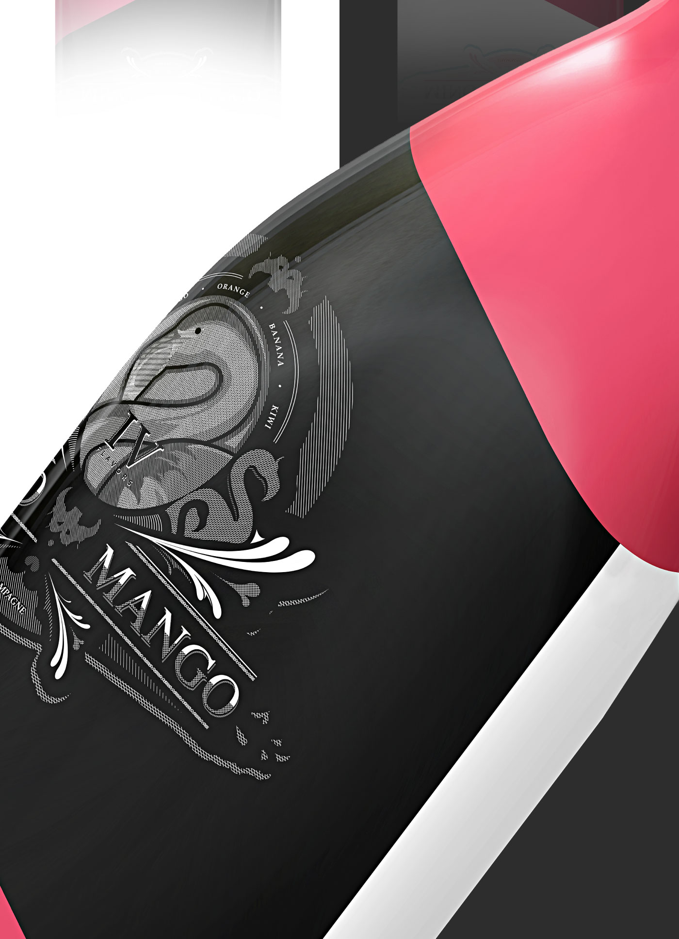
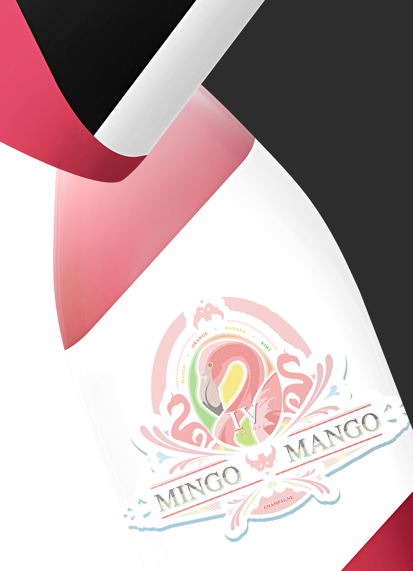
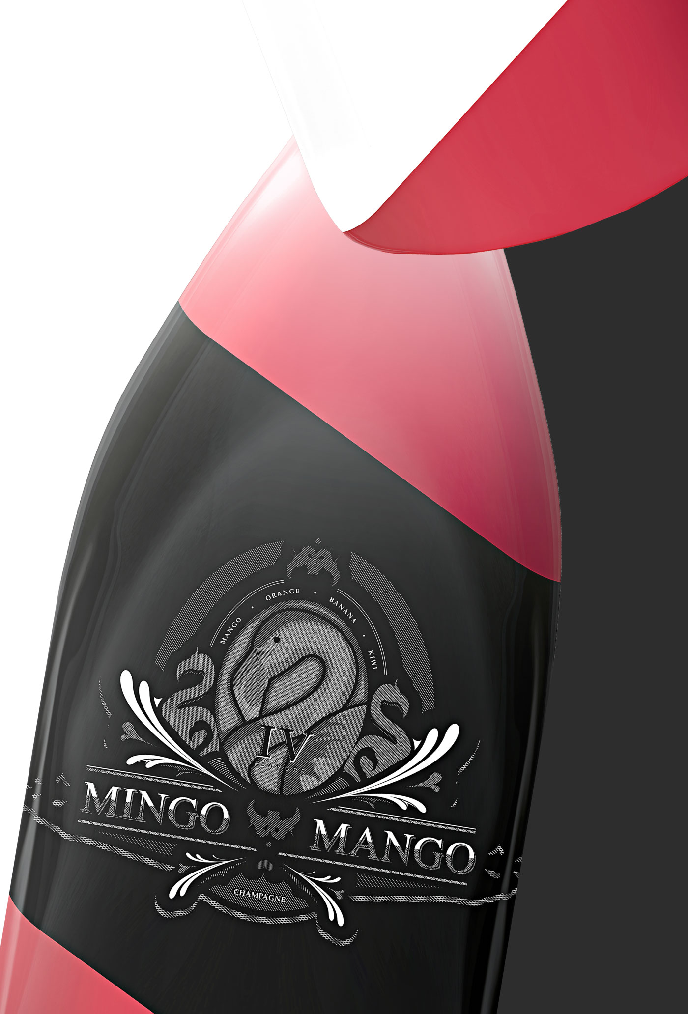
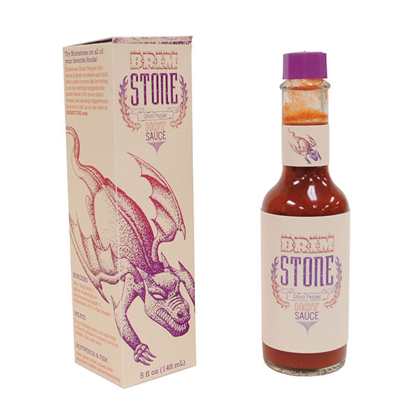
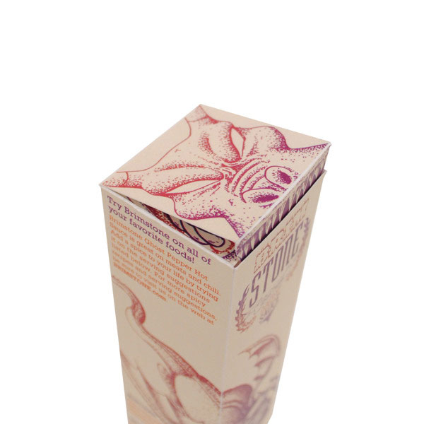
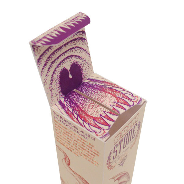
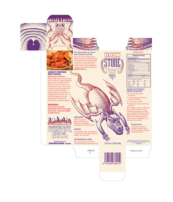
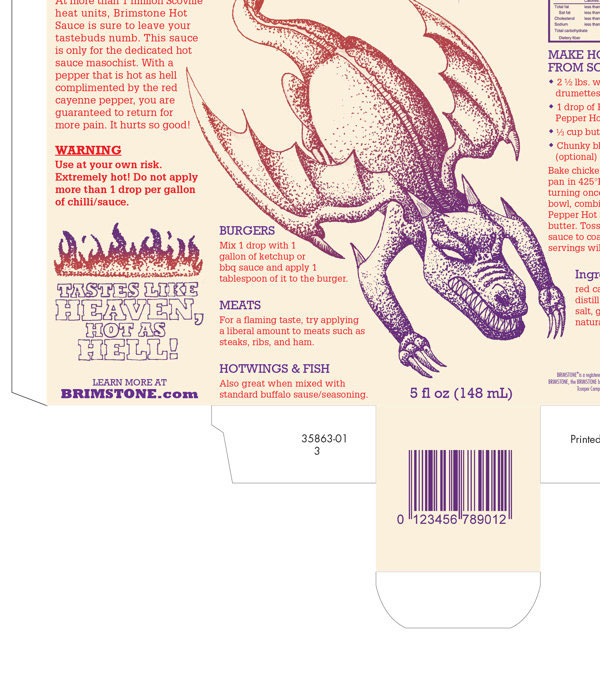
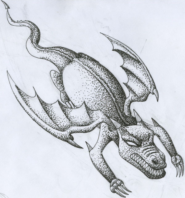
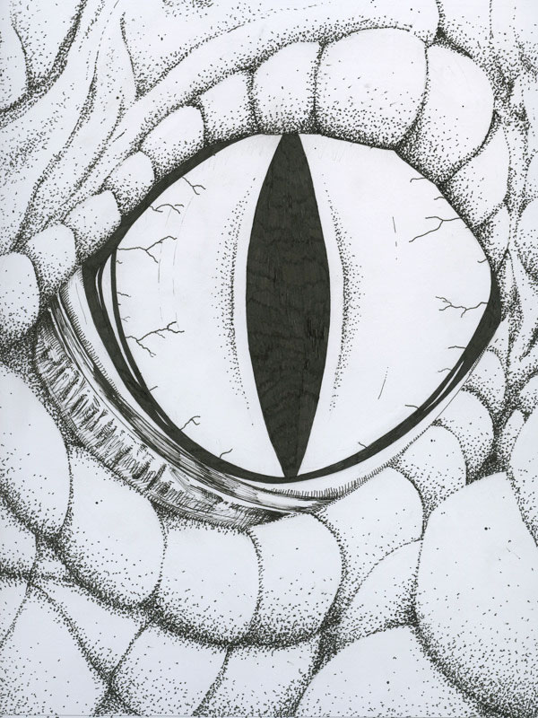
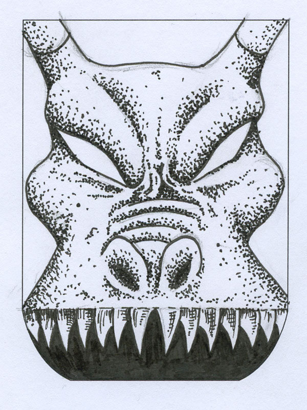
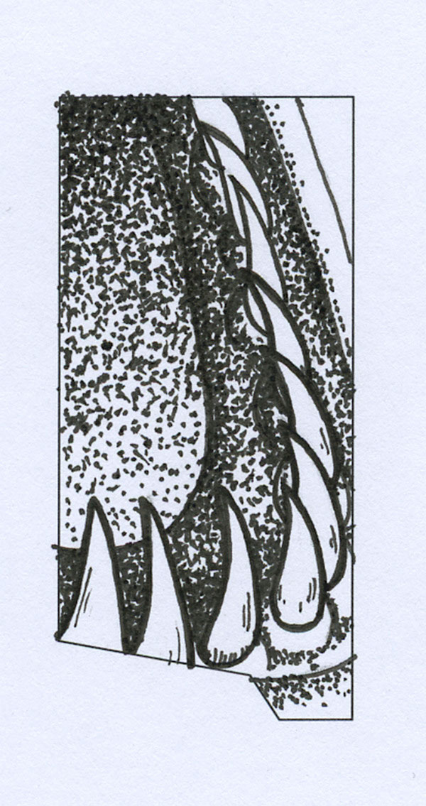
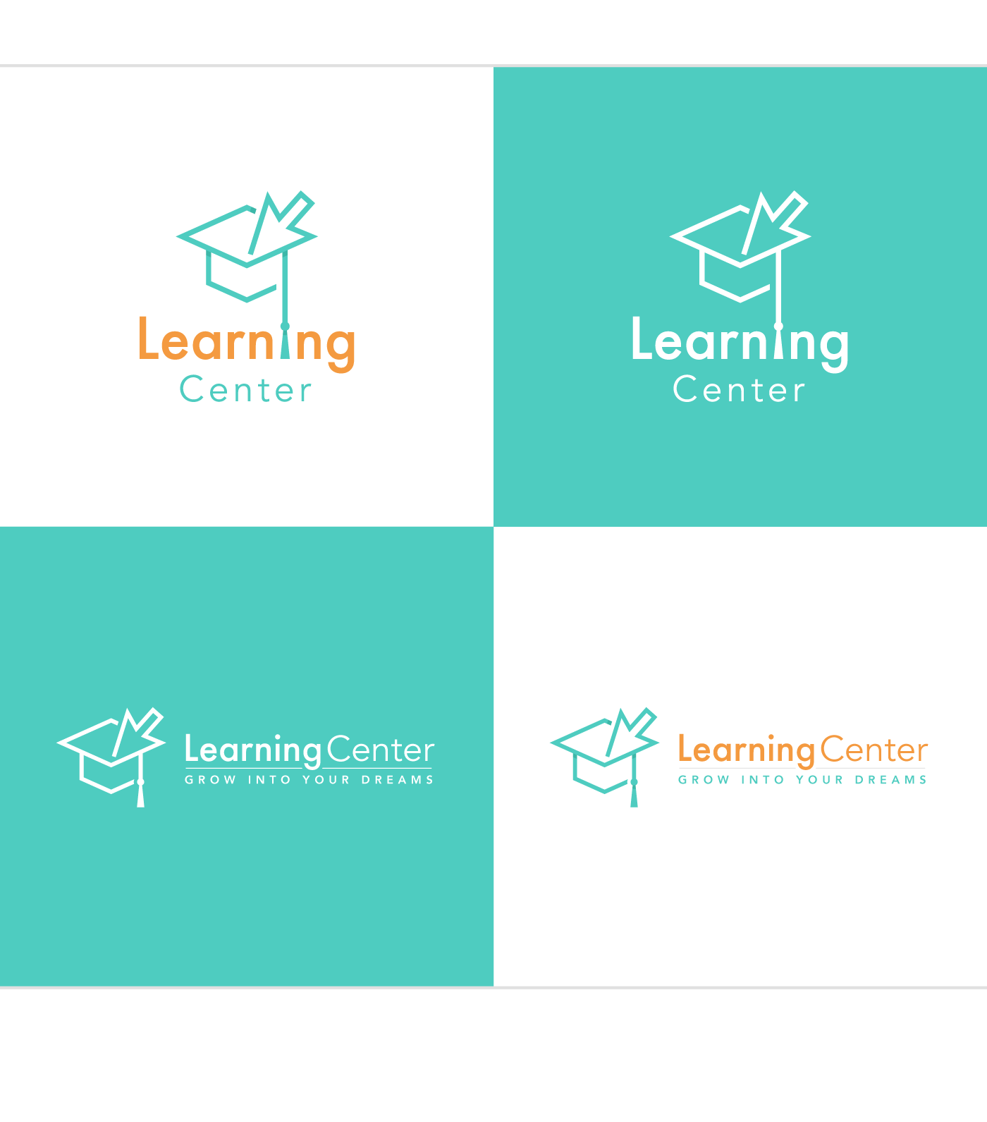
Brand, Package, Illustration
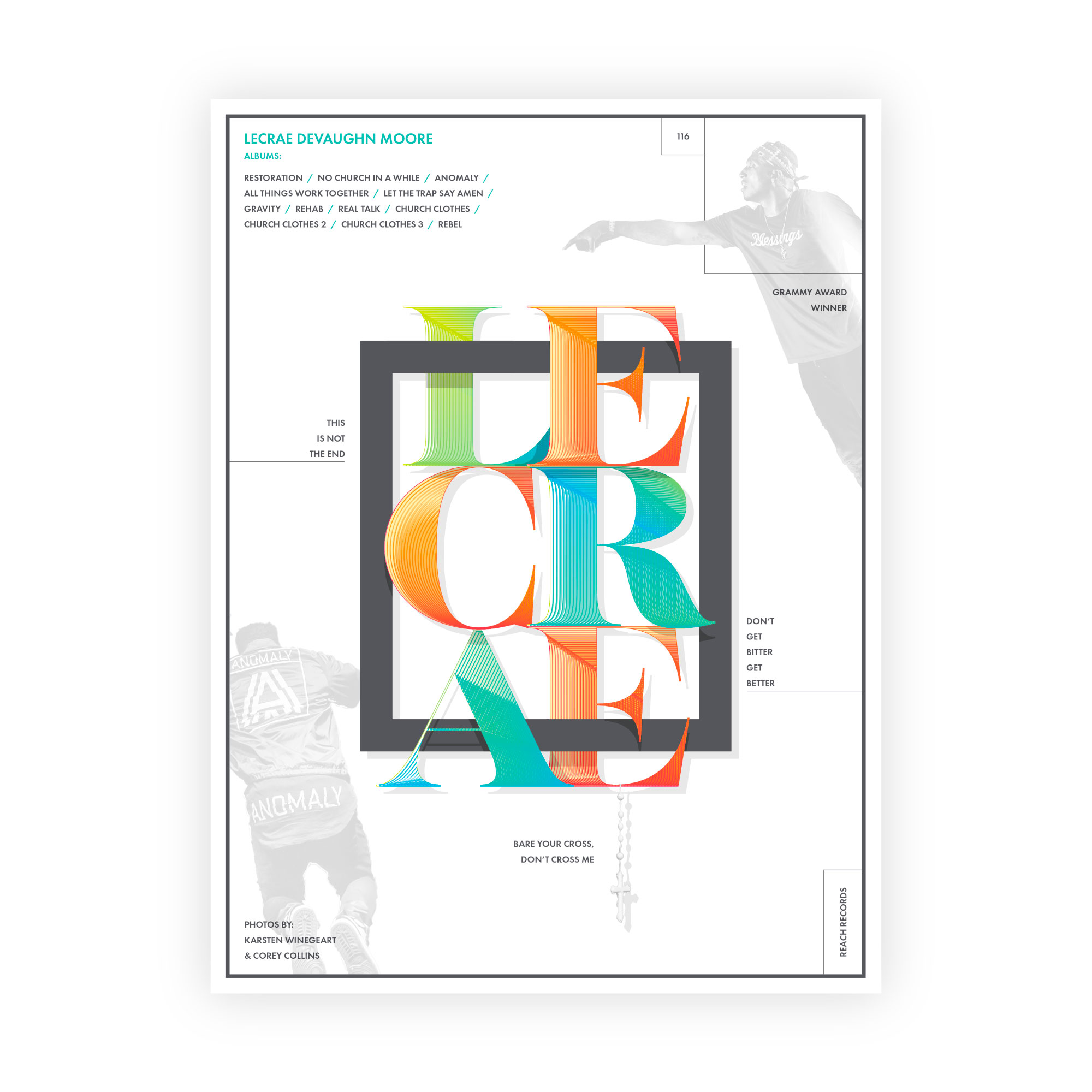
Brand, Typography, Layout

Brand, Typography
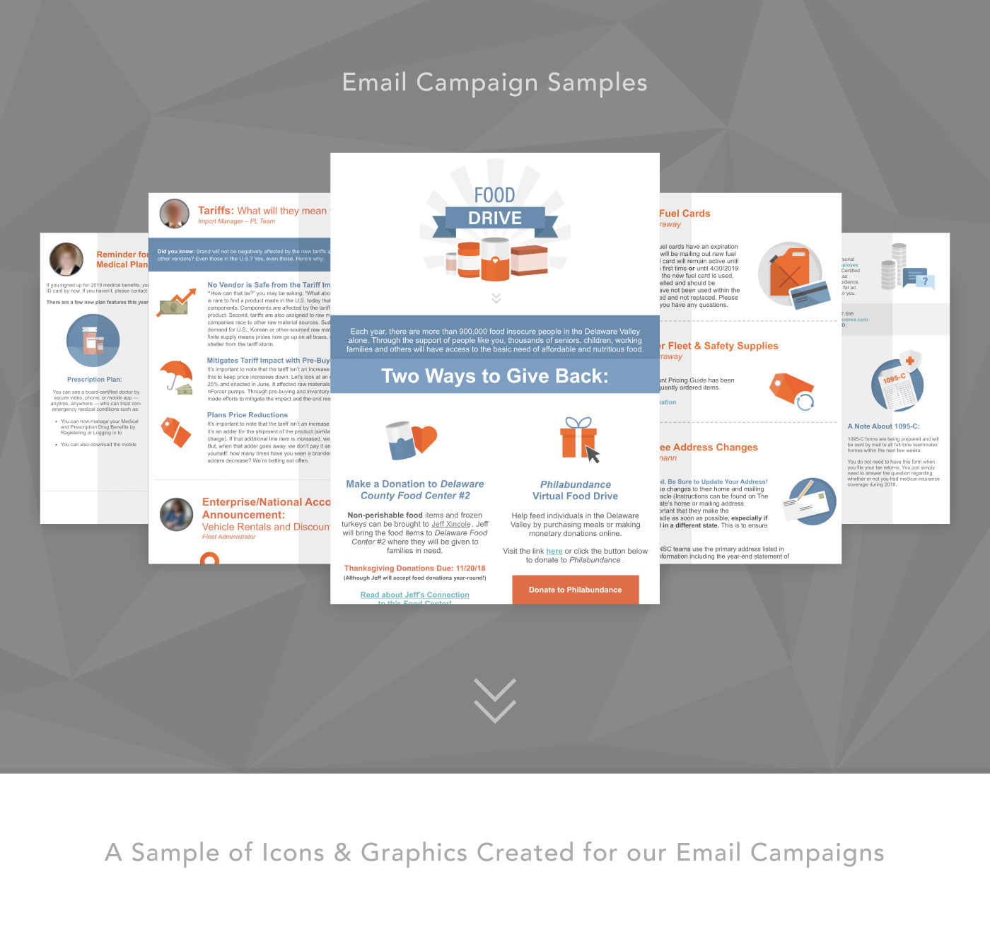
Email, Brand

Animation

Brand, Animation
Brand, Typography

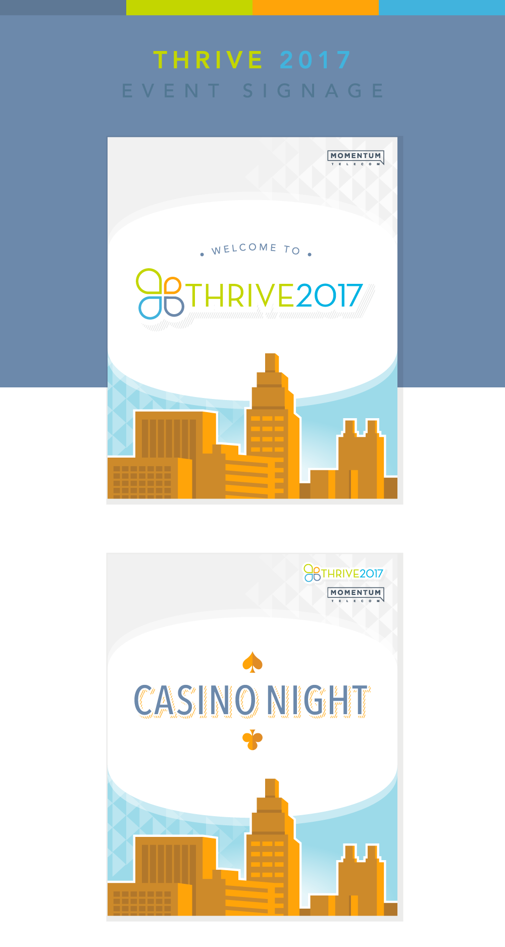
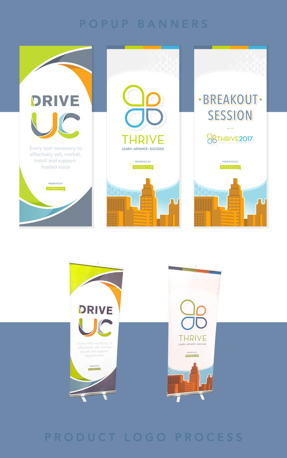
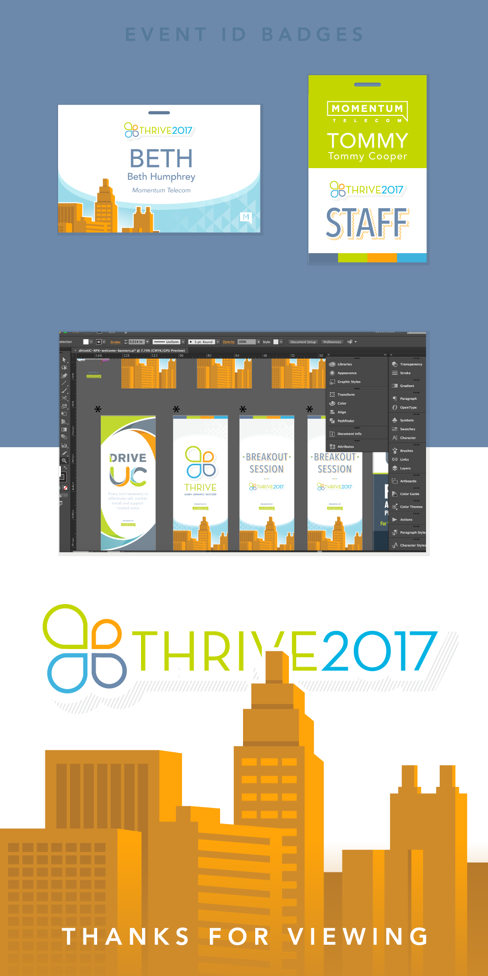
Brand, Signage
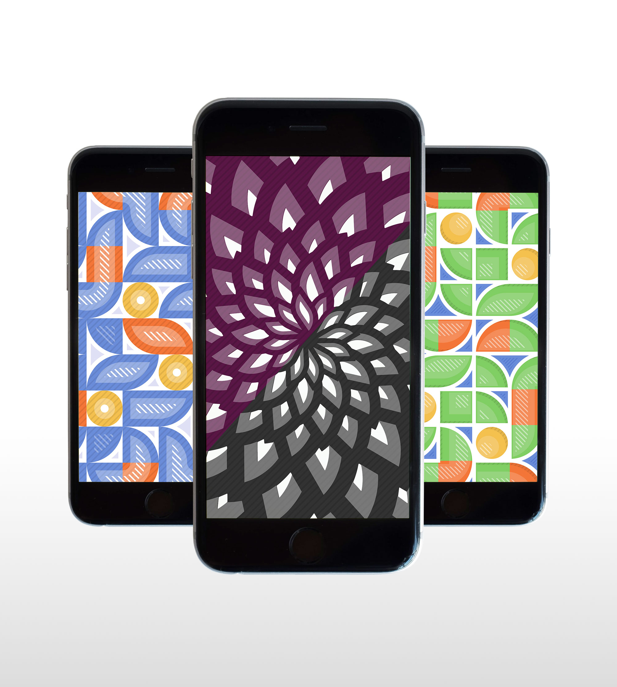
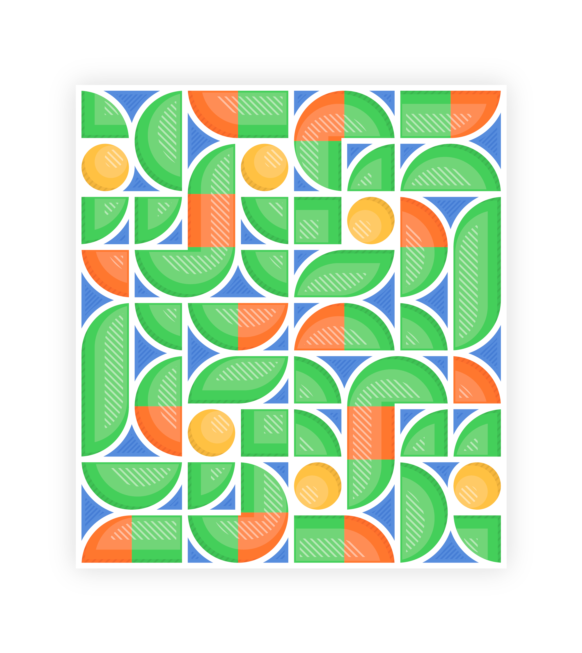
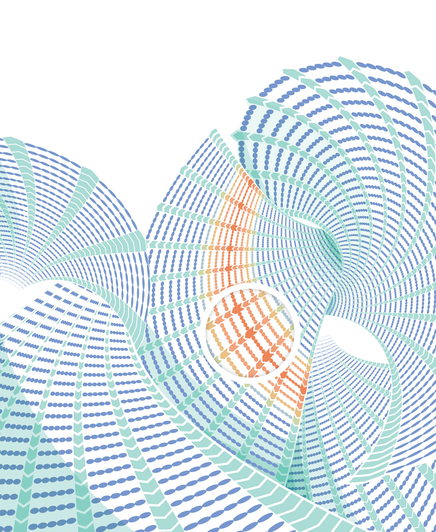
Pattern Design
Brand, Package

Typography
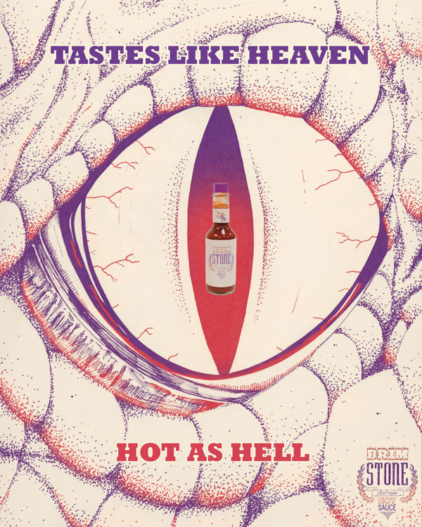
Ad, Brand

Animation, Typography
Brand, Layout
Typography
Book Cover
Brand, Package, Animation
Brand, Package
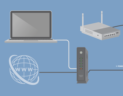
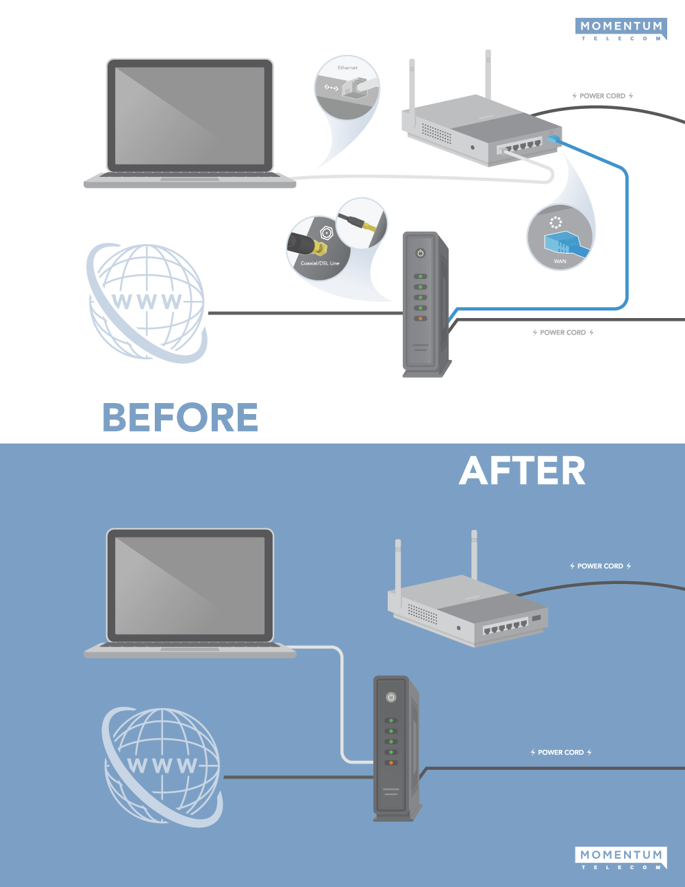
Signage, Infographic
Typography
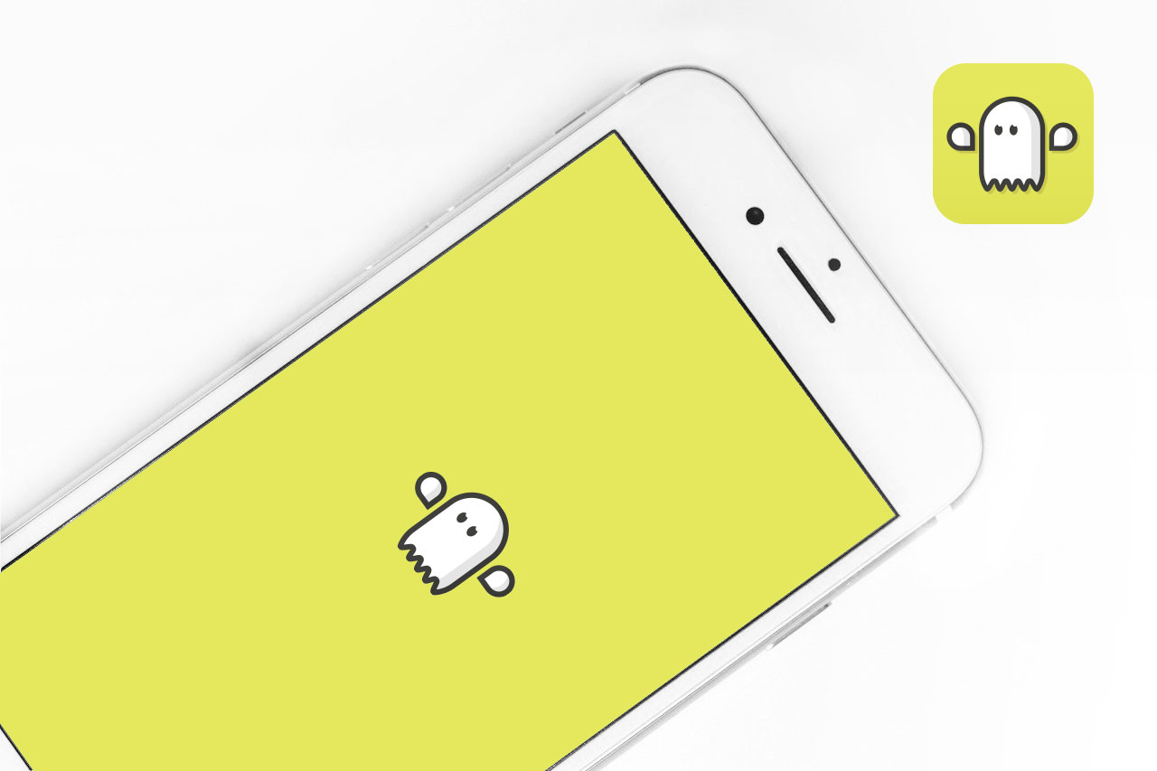
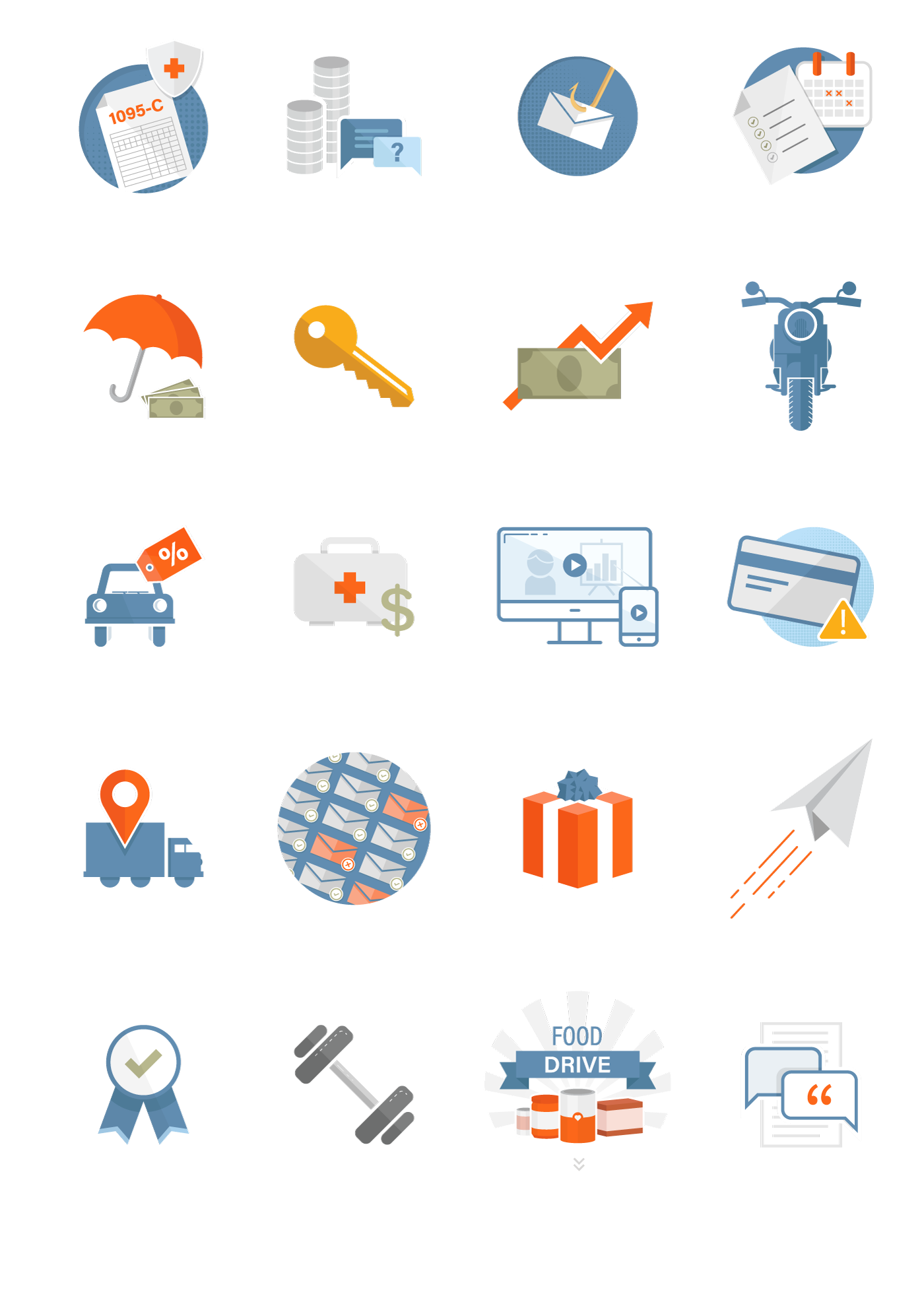
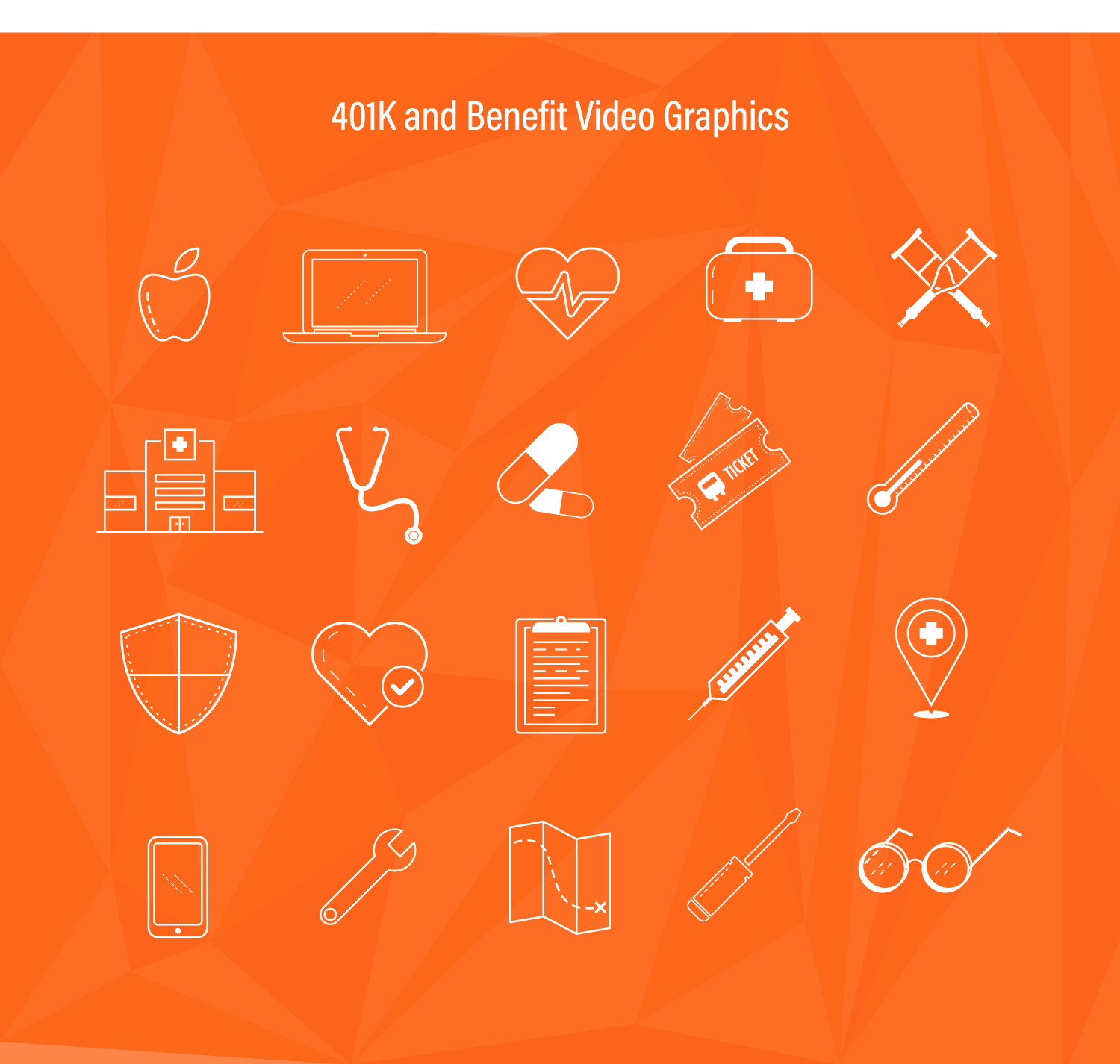
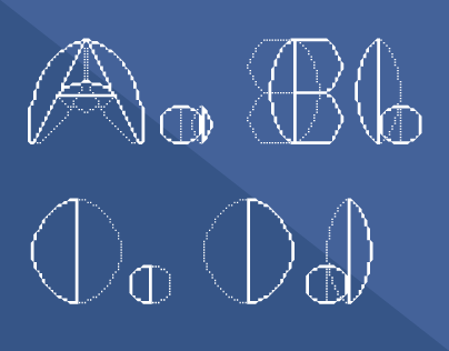
Icons